Problem
Southern Power Fund (SPF), a nonprofit organization, wanted to illustrate their impact more effictively so they could boost individual and large-scale donations. I was on a team with 4 other designers who were working together for the first time. We had three short weeks to not only work on the project, but also to figure out how to collaborate as a team. Everyone was passionate about contributing in meaningful ways, but we lacked leadership, clarity of roles, and alignment around goals.
Impact
I used my background as a former teacher and principal, to construct four design sprints over two days that brought the team together, specified our roles, and set an understandable direction for the remainder of the project. With the team aligned, we ultimately designed a site that improved the navigation flow and reduced the bounce rate by 60%.
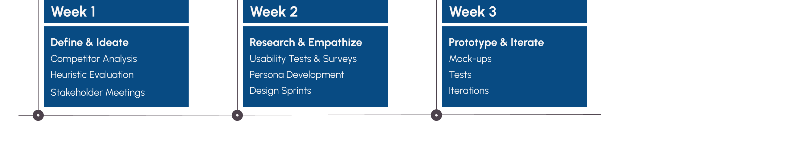
Project Timeline
The Call-To-Action: Designed to Fail
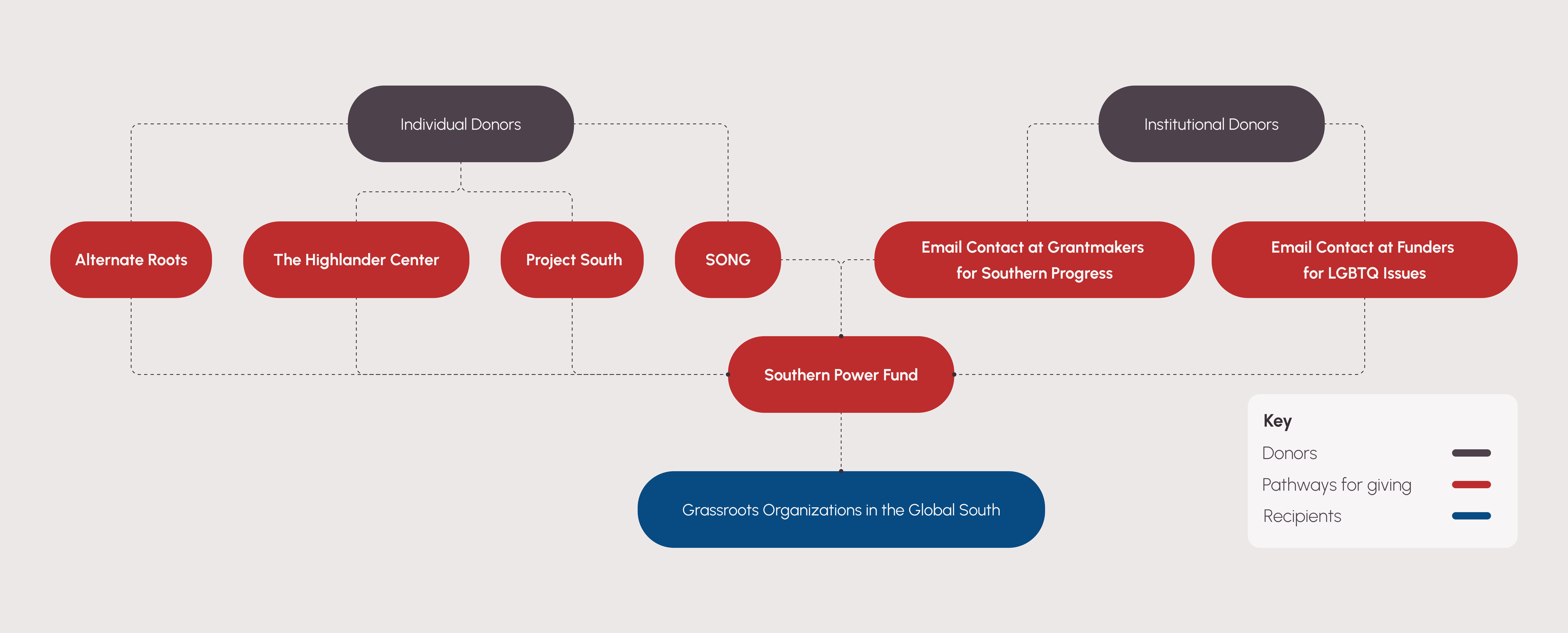
Let's go back a bit. During usability tests, we learned that users felt overwhelmed. SPF's site was wordy, redundant, and lacked familiar navigation patterns. While there was a clear call-to-action, "Donate Now," at the top of the page, each subsequent action was overly complicated. Ultimately, users were redirected to external sites to make a donation. Many abandoned the task, which was not the desired outcome.
SPF Existing Site - Hover over the annotion to learn more
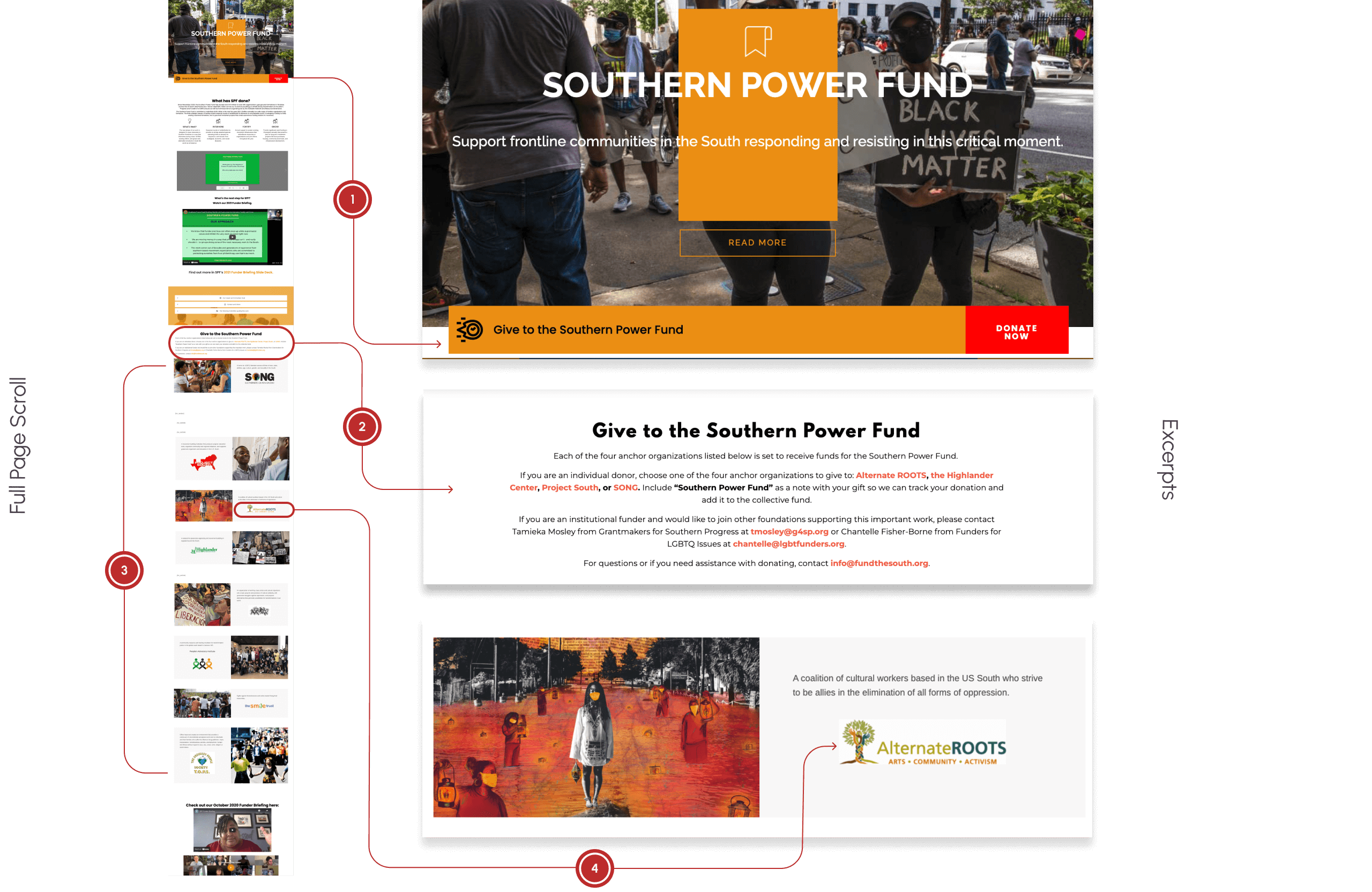
In order to donate, donors can only get to SPF's site using a direct link. The link doesn't include SPF's name and can't be easily found through an internet search.
The "Donate Now," button brings donors to a paragraph of complicated directions.
After weeding through the directions, donors need to pick one organization in the long scroll in order to move forward.
With limited information, donors pick an organization at random.
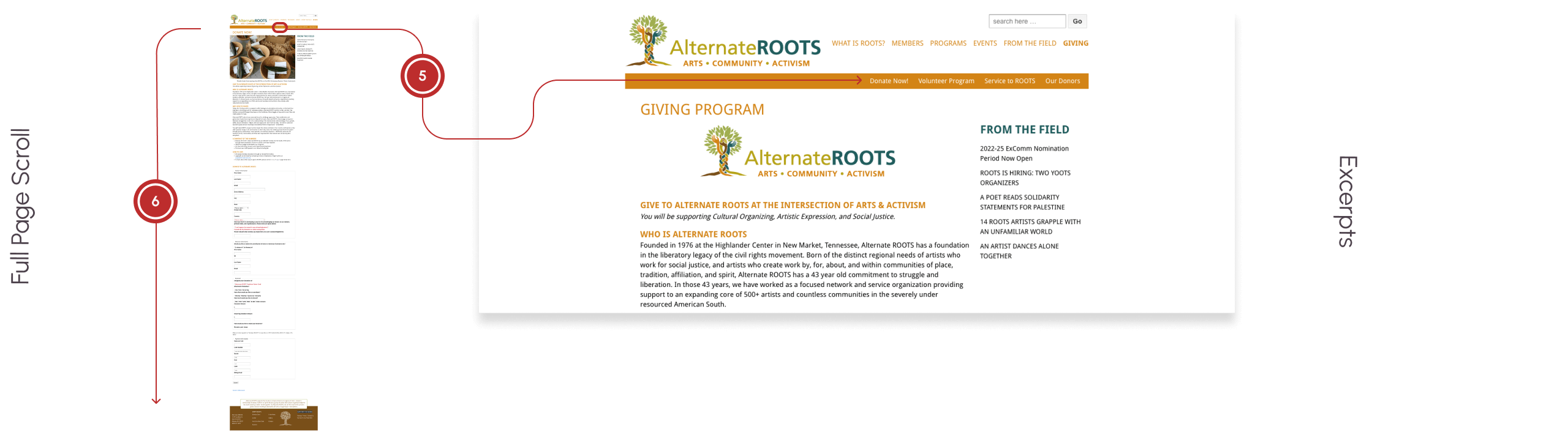
Donors are then redirected to another organization's website and away from SPF.
On the new site, donors have to start the donation process all over again.
There are 6 different pathways to give a donation that all lead away from SPF's site!
Developing the Value Proposition
The Kickoff Sprint clarified our value proposition to help SPF
- Create user-friendly navigation
- Develop content hierarchy
- Present statistics in a succinct and direct way
- Increase user retention to convert site engagement into donations
Conducting a card sort helped us to lay the groundwork for the site's content hierarchy. The team consistently grouped sections from the site in similar ways, even if their naming conventions varied.
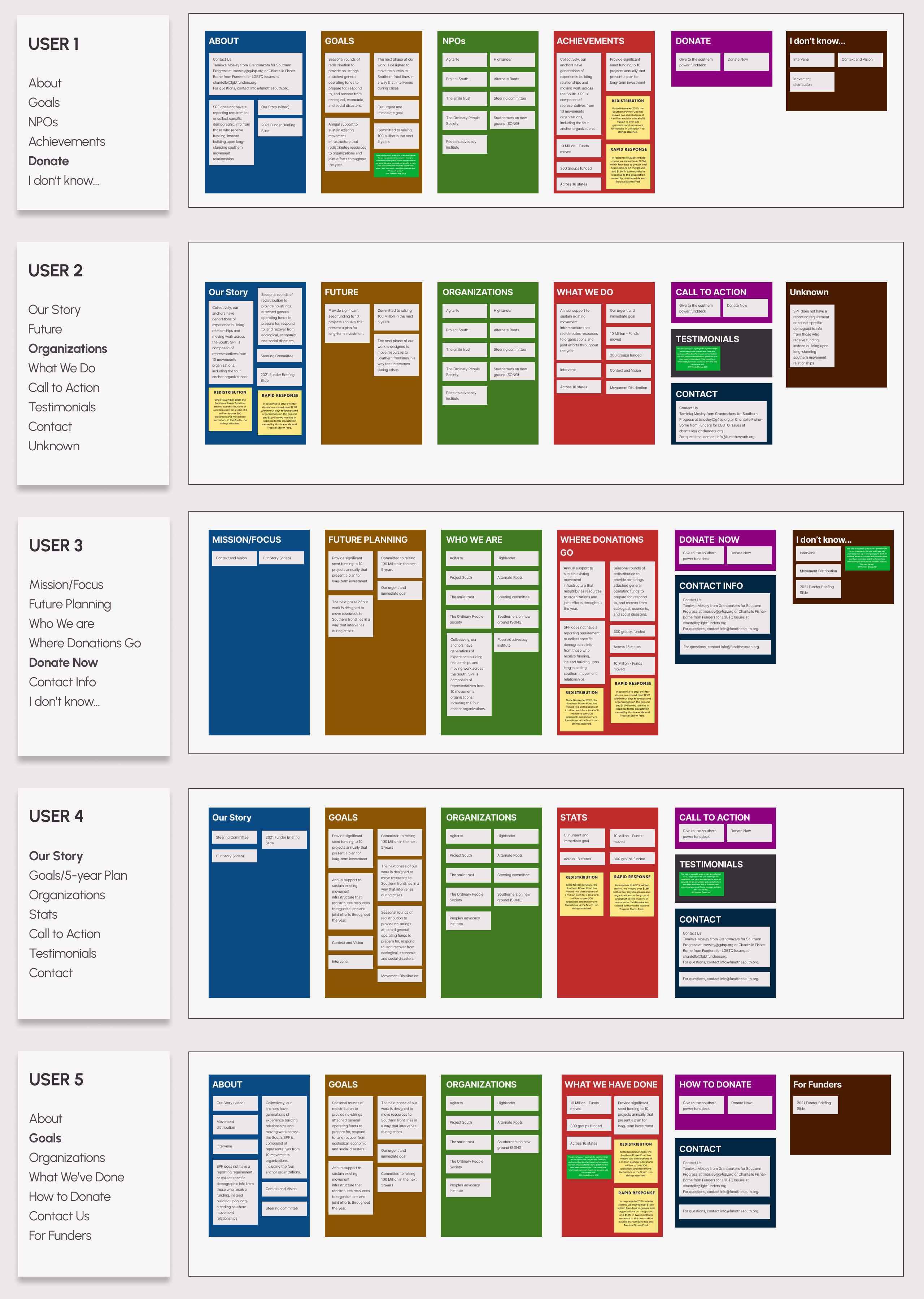
With that information, we planned an improved sitemap to facilitate intuitive navigation.
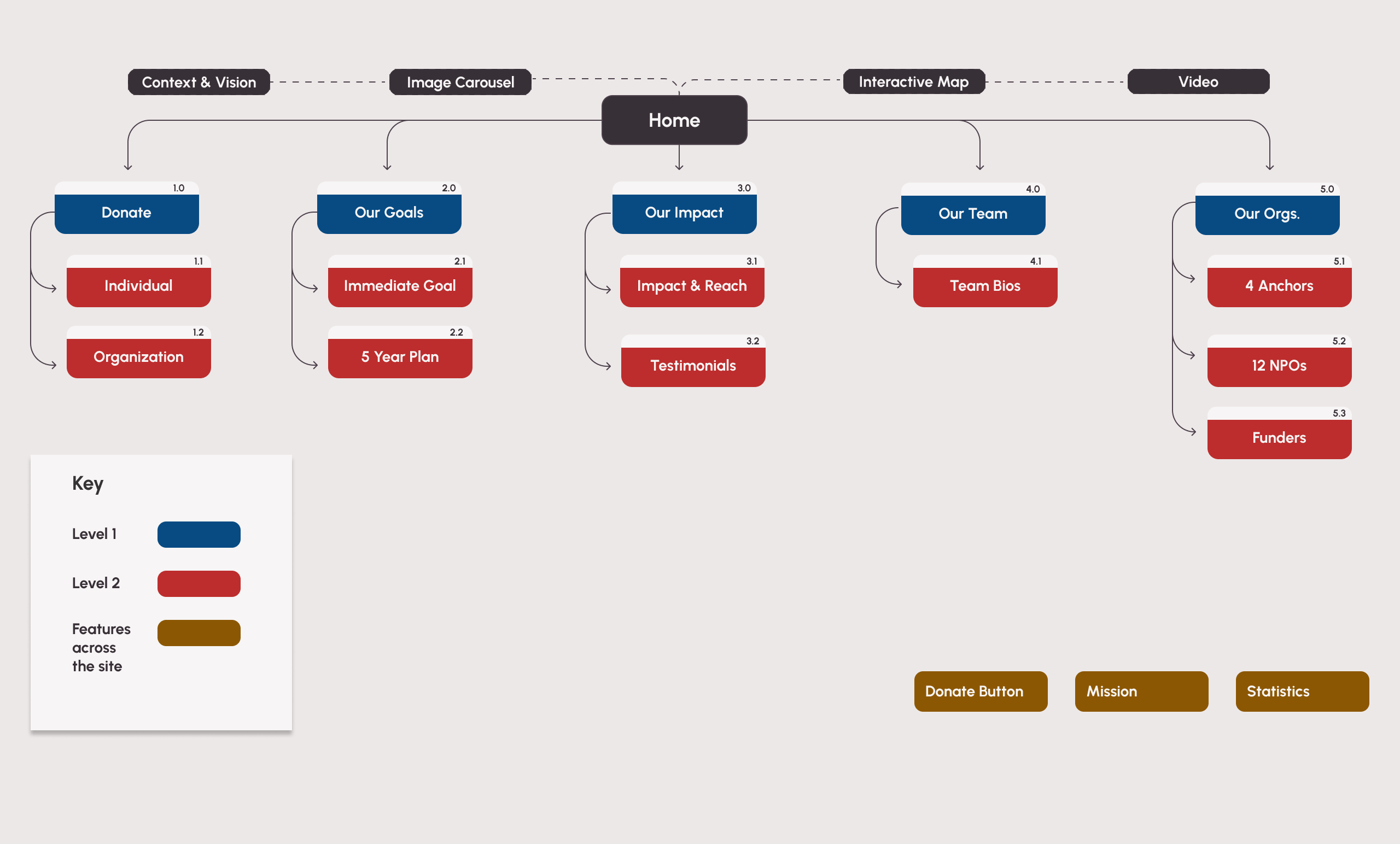
Identifying Key Features
With more clarity about the way the content needed to be organized, I facilitated the Floodgates Sprint. This helped us brainstorm as many elements and features as possible to make the content more digestible.
The features needed to include:
Real-time infographics
Easy-to-follow CTAs
Horizontal and vertical navigation to create movement
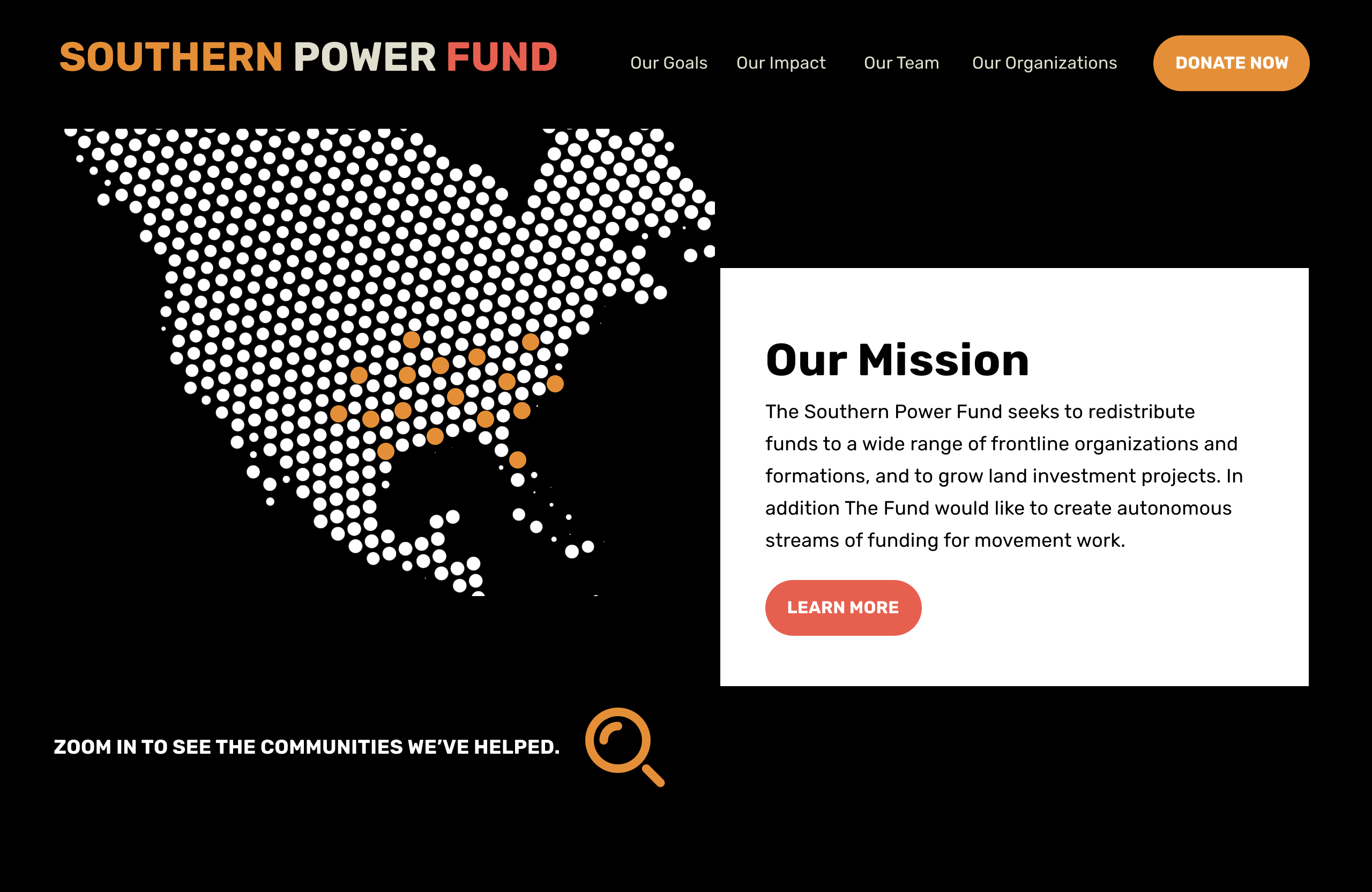
Interactive map to illustrate impact
Floodgates Sprint crystallizies team members' ideas
Driving Rapid Iterations
As the project was moving along, we had difficulty communicating consistently with the stakeholders. When we were moving onto drafting our prototypes, the stakeholder reemerged which brought a renewed, but urgent energy into our project. All of the sudden, we needed to go through wireframing, testing, prototyping, and iterating all in the span of a week. In order to get everything done, we found ourselves finishing mockups and testing in the same day!
I started the team with a 6-Up Sprint which allowed us to create at least 30 sketches of the main pages and reach consensus around must-haves for our wireframes.
- Prominent mission placement
- Standout “Donate” button
- Strong, narrative imagery
With clarity on the basics we swiftly dove into action.
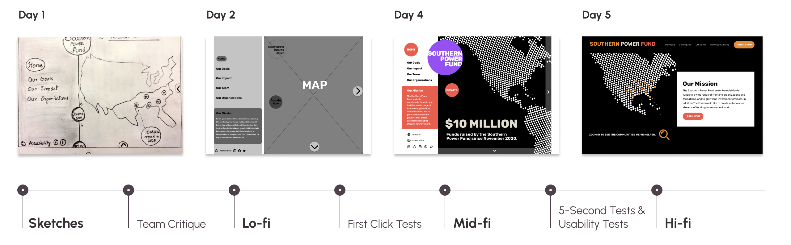
We prototyped in teams of two. Once one team was done, they would hand it off to an alternate team of two, who would then test it.
Assessing the Navigation with First-Click Tests
Results:
We achieved 100% Task Completion Rate.
But we weren’t done.
Keeping the Throughline between Teams
All along, I needed to manage leading the team through this intense timeline, laying the groundwork for productive communication, designing parts of the prototypes, and providing feedback to the team that would keep us aligned. Through this frenzy we continued, until finally we had a hi-fi prototype that addressed many of the issues we identified in our initial research.
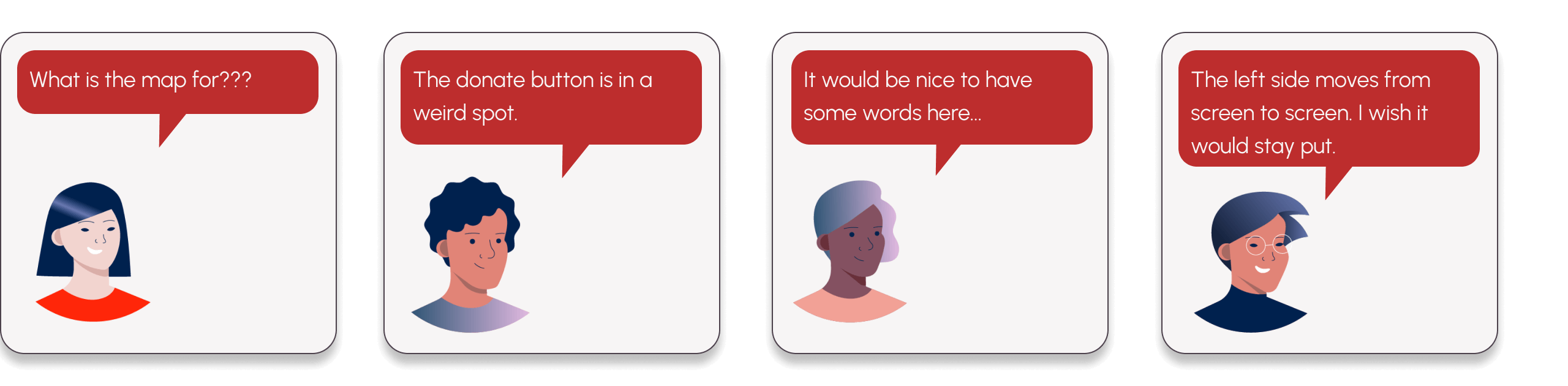
Incorporating Feedback
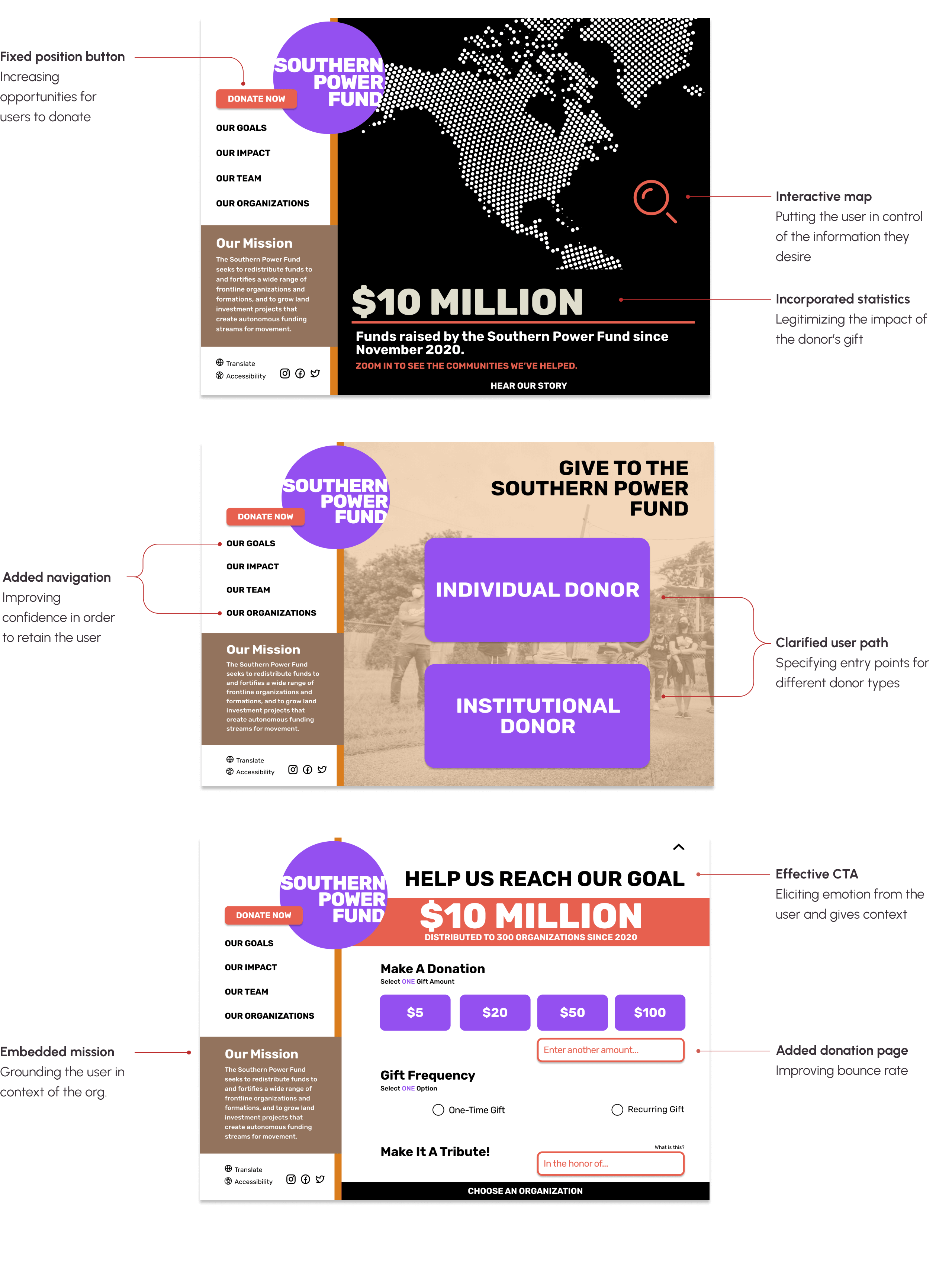
Final Iteration
Reflections
Ultimately, I loved working on this project because of the nuance involved in each phase.
- For SPF it was important that the design inspire users to donate.
- For a new team working on a short timeline, we had to learn how to let individuals shine while blending multiple visions together.
- For me, I realized that I needed to use my background as a manager to build team trust and cohesion.
I created space for divergent thinking and ambiguity, to eventually build consensus and collaboration.