Problem
Grapevine Property Services (GPS) was looking to reroute users from calling the office for non-urgent property issues. They asked our team to audit and reconfigure the website in order to mitigate the inefficiencies caused by unnecessary phone calls to the office.
Impact
Our work resulted in 48% increase of the customer base. We reorganized the user flow so that homeowners could easily put in a request, read up-to-date announcements, and find an emergency number on the website. In addition, we identified key strategies that GPS could use to build on their relationships with current and new users.
Project Timeline
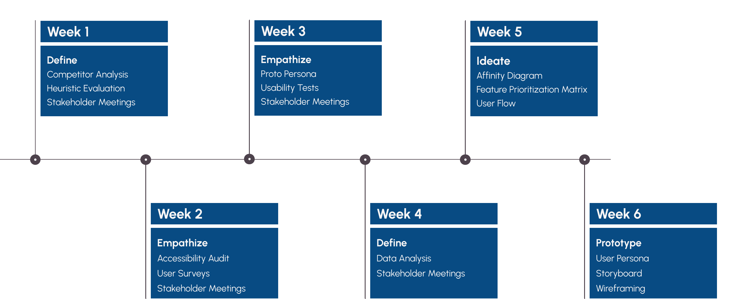
My Role
I led a team of 4 other designers using an Agile methodology. While prioritizing stakeholder input throughout, I drove the strategy, illuminated key insights from our research, and collaborated with the creative director and lead researcher, continually. My goal was to keep the team aligned and focused on designing solutions that would retain core users and engage new ones.
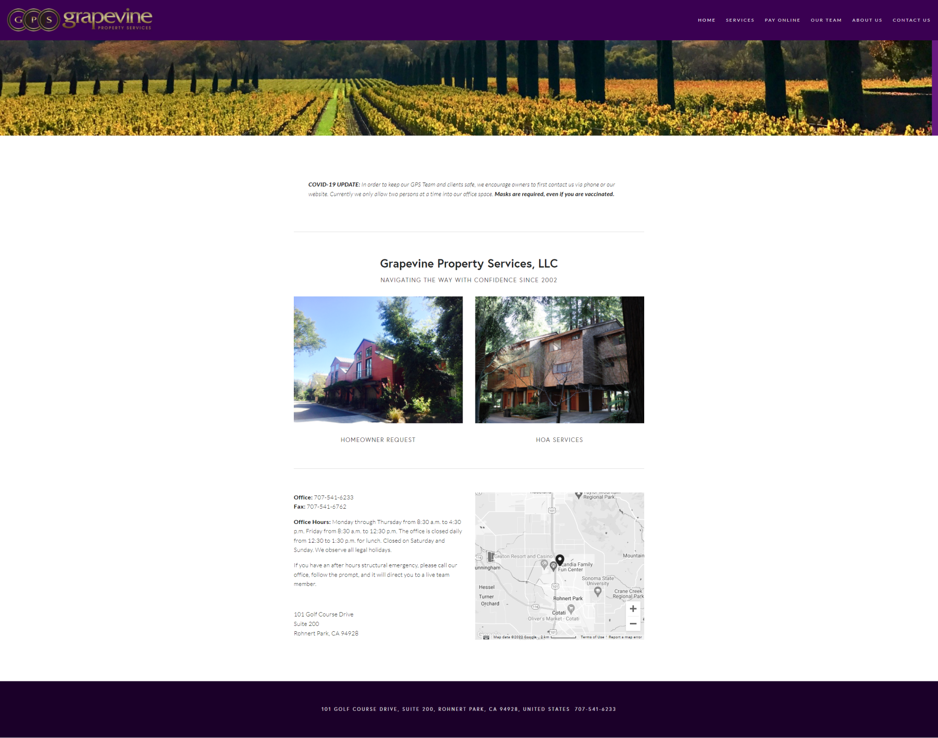
GPS Homepage | Before
Identifying the Main User Groups
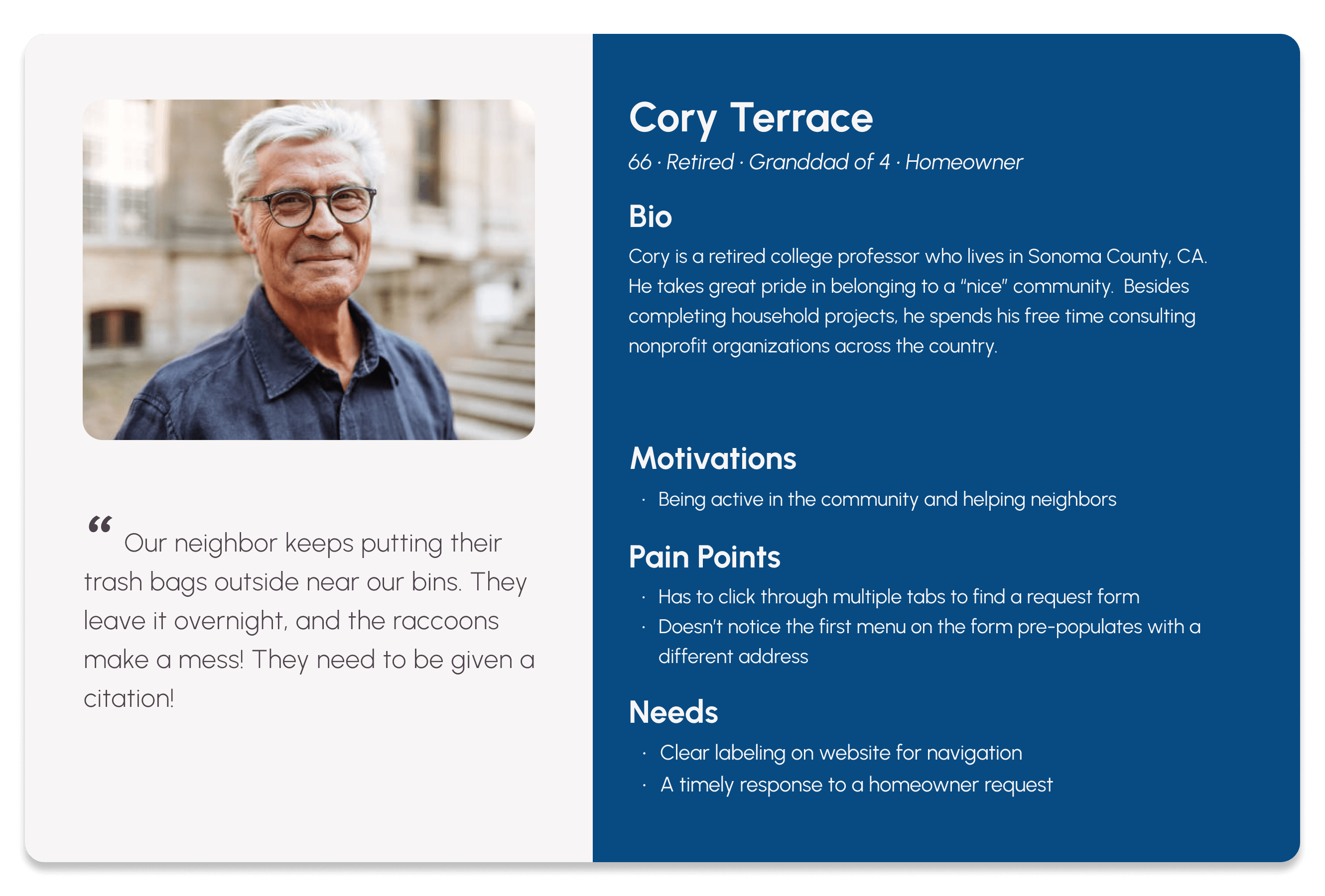
GPS manages 65 different homeowner associations (HOA) encompassing more than 2,300 units. GPS has three types of users who frequent its website: homeowners, HOA boards, and realtors. These groups rely on the site for different reasons.
It was my job to keep us centered on the problem, which was encouraging reluctant users to turn to the website to submit requests. With that clarity, I knew that we needed to focus on the homeowners. They made the most phone calls to the office. To understand more about our users' motivations and difficulties, we deployed a initial survey and ran several usability tests.
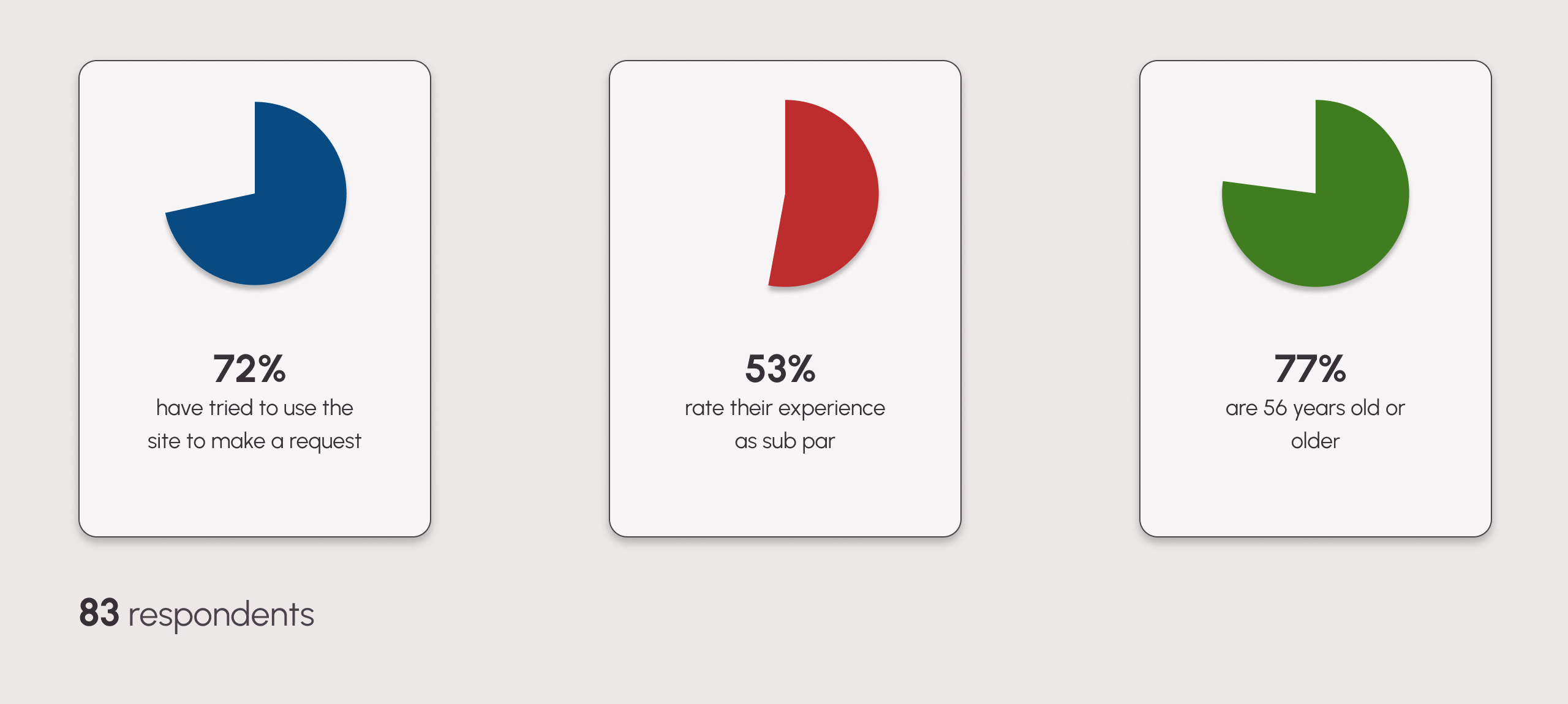
Key Findings
The Challenge for the Business
GPS wanted to funnel all communication through the website. However, with more insight from the users, I learned that they prefer to contact the office by phone or by email, because those methods were more straightforward. The usuability tests revealed that users were frustrated at various points when using the site.
Homeowner Request Form - Hover over the annotion to learn more
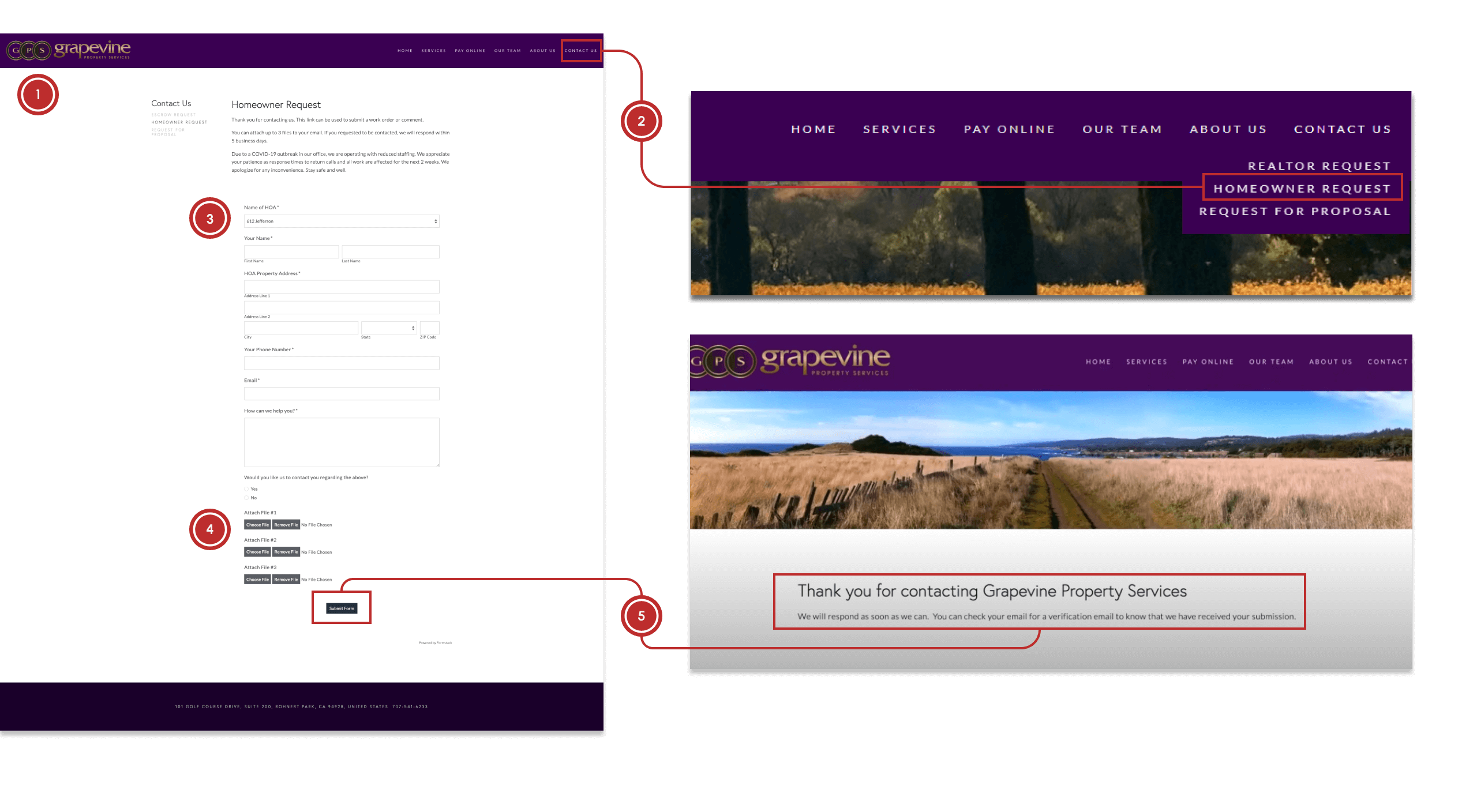
Users are deterred by the length of the form
The majority of users do not initially look under “contact us” when they want to issue a complaint
The dropdown auto populates and users don’t notice, leaving this field miscategorized for GPS staff
The colors of these buttons make them look inactive, leaving users confused
The confirmation leaves uncertainty about a response time
After synthesizing the results of the survey and usability tests, we devloped a user persona to guide us as we started to move toward drafting solutions.
Designing for Emotion
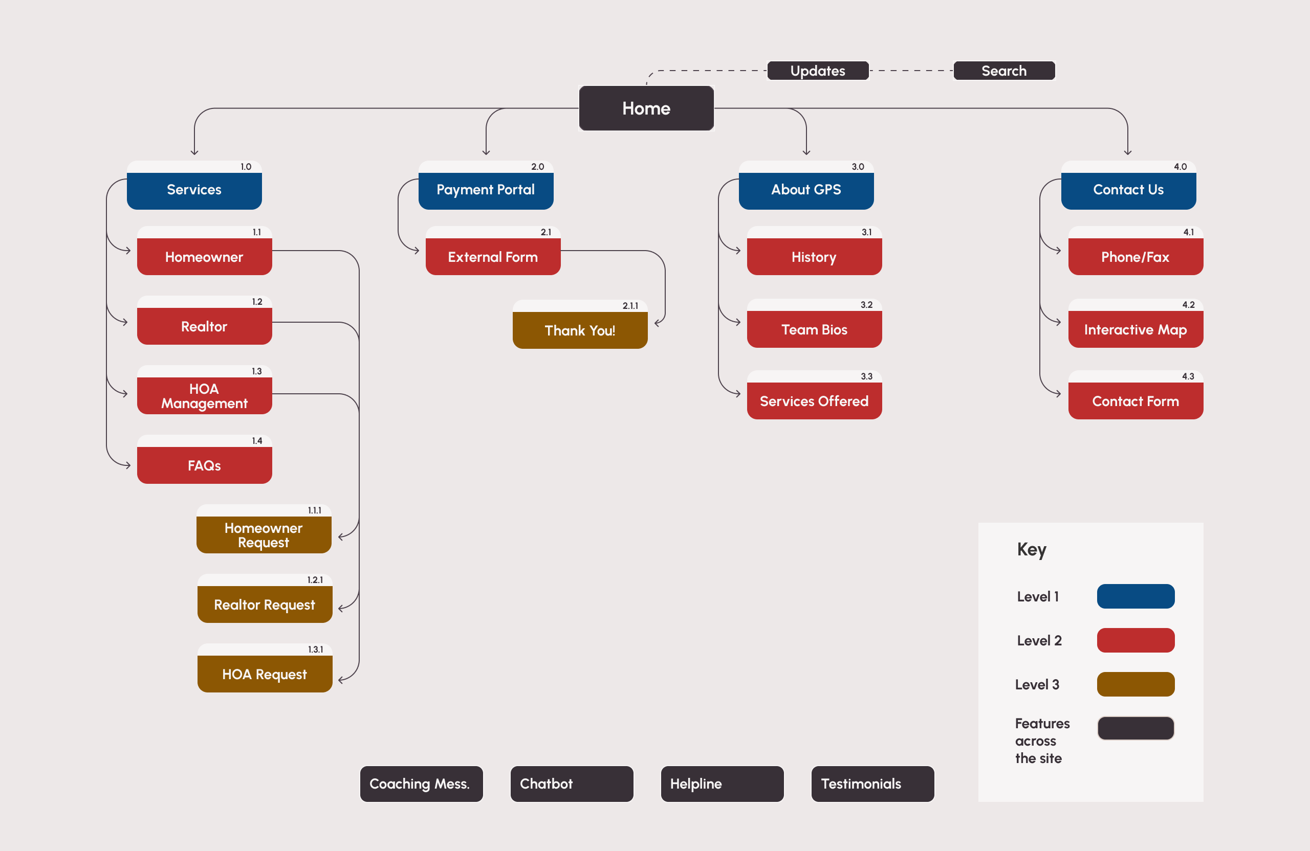
Our goal was to create a website experience that was captivating, gratifying, and comforting for users. Moreover, it was essential to minimize the cognitive load for users. As a result, we concentrated our efforts on refining the information architecture.
Revised Sitemap
Designing for Function
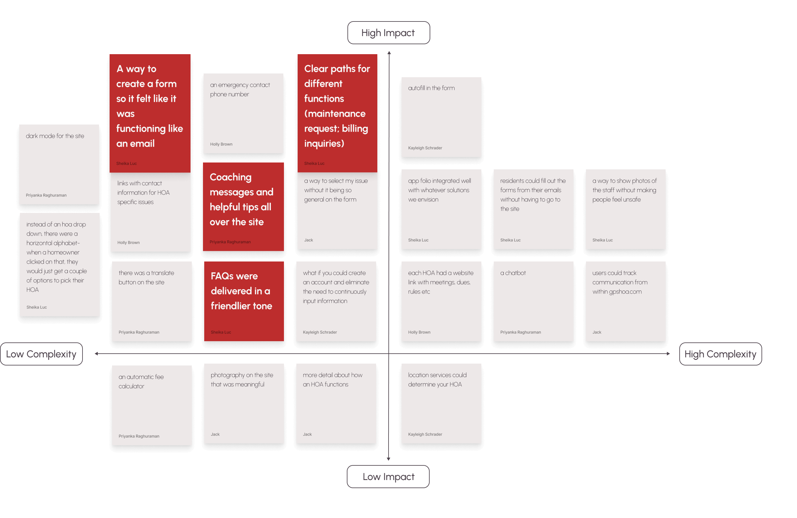
I led the team through several sessions of brainstorming to plan the core features of the site. It was important that we focused on the findings from the research; the features needed to match the mental models of our core users, the majority of whom were over 56 years old.
Feature Prioritization Matrix
Incorporating User Feedback
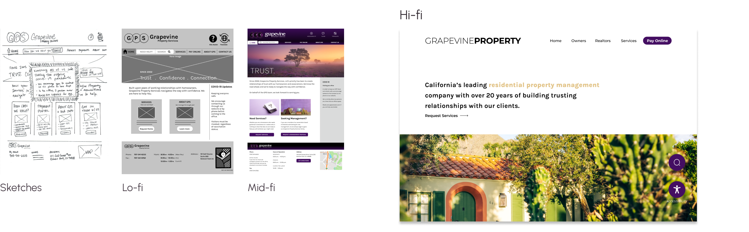
There were a few surprises during the wireframing process. Between each fidelity, I planned and executed usability, A/B, and 5-second tests. Two of the biggest iterations we made were to place all content above the fold and reposition the hero image to the bottom of the page, both in response to feedback we got during usability tests. Our user was not inclined to scroll down the page if they didn't immediately find what they were looking for.
Wireframe Transitions
The Outcome
We streamlined the website further by:
- Clarifying navigation labels
- Adding search, translation, and accessibility features
- Removing redundant content
- Revamping the use of brand colors
These changes resulted in a cleaner, more user-friendly interface, reducing user intimidation and enhancing the site's effectiveness as a communication platform.
Reflections
Leading this project was both rewarding and challenging. With tight timelines and competing priorities, I often found myself juggling to balance our client's expectations, address user feedback, and manage team dynamics. Drawing upon my prior experience as a principal, I focused on setting manageable goals, aligning the team, and ensuring effective communication throughout the project.